The Boston Housing Prices dataset was collected by Harrison and Rubinfeld in 1978. This dataset measures the housing prices against various factors which define the neighbourhood. The data consist of 506 observations and 14 independent variables. The variables are listed below along with their meaning:
- crim – per capita crime rate by town.
- zn – proportion of residential land zoned for lots over 25,000 sq. ft.
- indus – proportion of non-retain business acres per town.
- chas – Charles River dummy variable (= 1 if tract bounds river; 0 otherwise).
- nox – nitrogen oxides concentration (parts per million).
- rm – average number of rooms per dwelling.
- age – proportion of owner-occupied units built prior to 1940.
- dis – weighted mean of distances to five Boston employment centers.
- rad – index of accessibility to radial highways
- tax – full-value property-tax rate per $10,000
- ptratio – pupil-teacher ratio by town
- black – 1000(Bk – 0.63)^2, where Bk is the proportion of blacks by town.
- lstat – lower status of the population (percent).
- medv – median value of owner-occupied homes in $1000s.
Here, medv is the house price and is the response variable while others are predictor variables.
In this post I mention some statistical concepts I understood while playing with this dataset using R.
1. Multicollinearity
Imagine two or more predictors that are quite close to each other. Statistically speaking they are highly correlated. There is a substantial degree of linear relationship amongst them. The problem with this is that, when you have a strong correlation between your predictors, you can’t separately credit one predictor for the outcome variable. Essentially separating them becomes difficult, and that can impact your analysis of valuable (or redundant) predicators.
Following are the correlation values of the dataset. Can you spot the highly correlated predicators ?
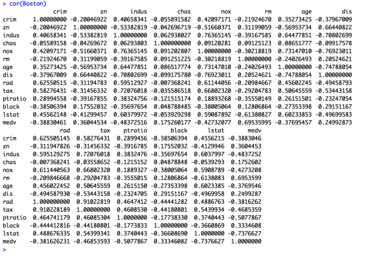
rad, tax, indus and nox fall in this category. Probably their meanings also suggest the same.
There is a way to detect such predictors. This is done using a statistical concept called variance inflation factor. Correlated predicators increase the variance of the regression coefficients. This method calculates the inflation amount and helps in trimming those predicators out. Generally, a VIF between 1 and 5 is signifies moderate correlation, and greater than 5 means significant correlation.
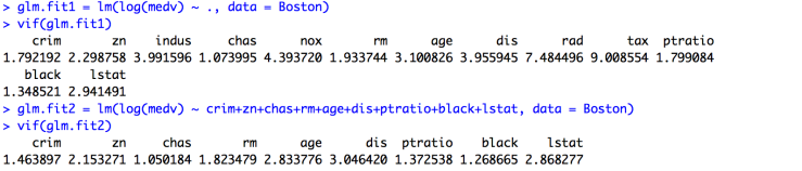
The difference in the two glm.fit is the presence of highly correlated predicators, which have been removed in the second one. The values of vif for each fit are consistent with the observation too.
2. Outliers
Outliers are the data points which (obviously as the name suggests) lie a little farther away from other points. The significance of outliers is their ability to manipulate the model estimates. It is always worth it to look for outliers, analysis and decide to keep them or exclude them.
These outlying points have an influence on the model. This influence can be summed up using two parameters. One, the difference between the observation’s value and mean 0f the predictor variable. This is called leverage. Second, the difference between then predicted value of that observation and the actual value. This is the distance.
Leverage is necessary for understanding how influential a data point is. Higher the leverage, higher the chances it will be an influential observation. It is very important to understand that influential doesn’t necessary mean that you can’t exclude the point. It just means that it can sway the regression line in its favour.
Cook's distance can be used to pin point observations which can be removed from the dataset. Essentially, this statistic measures how impactful a particular observation is. This is done by measuring the difference between the predictions of all values in the model, with and without the data point in question. An impactful data point can distort the accuracy and outcome of the prediction. Generally, an observation with a Cook’s distance vale greater than 1 is considered impactful. Also, some guidelines used 4/n or 4/(n-k-1) as a threshold, where n is the number of observation and k the variables.
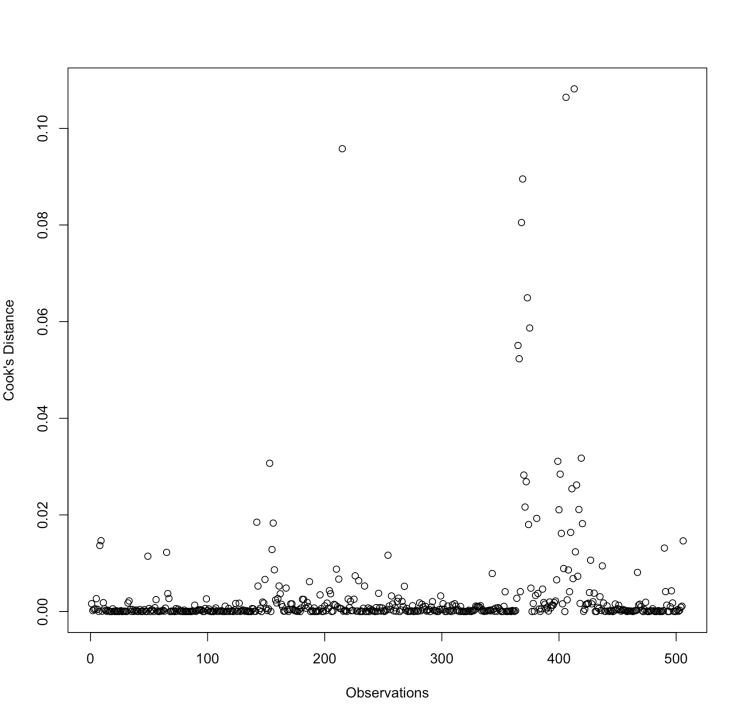
This is the plot of cooks.distance(glm.fit2). This method is available in the car library in R.
3. Residuals
This is a simple concept. It is the difference between the predicted values and the observed values. But analysing them gives us a big edge. A very common way is to use various residual plots. (Warning: big white plots ahead !! :P)
The concept behind residual analysis is that the residuals shouldn’t be following a pattern. The residual errors should be approximately normally distributed.
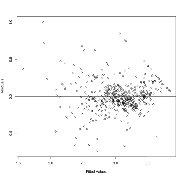
The residuals are randomly scattered. This means linear regression works fine for this dataset. Instead, if we get a plot which forms a non-random shape (like a U or an inverted U) then we need to look more closely into our model (or maybe try a new one, or maybe clean the dataset a bit).
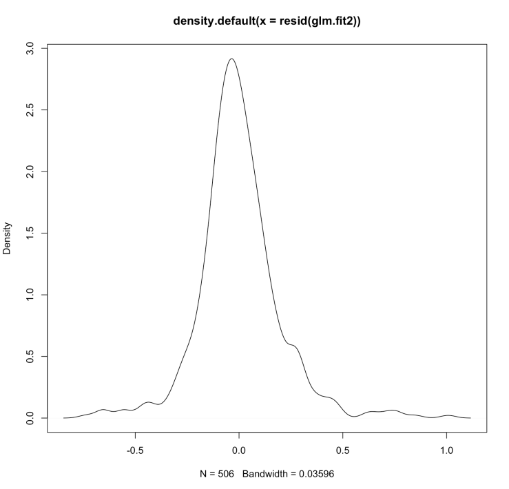
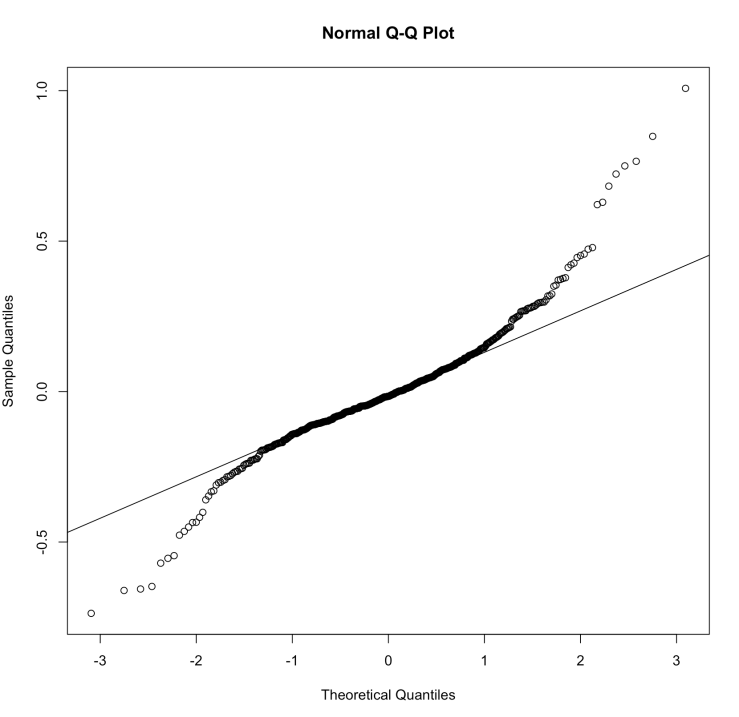
These graphs show that the residuals are normally distributed.
This is the code for the above graphs.
plot(glm.fit2$fitted.values,resid(glm.fit2),xlab='Fitted Values', ylab = 'Residuals')
abline(0,0)
plot(density(resid(glm.fit2)))
qqnorm(resid(glm.fit2))
qqline(resid(glm.fit2))
Thank you for reading. Bye.
References:
http://support.minitab.com/en-us/minitab/17/topic-library/topic-library-overview/
http://onlinestatbook.com/2/regression/influential.html
http://blog.minitab.com/blog/adventures-in-statistics/why-you-need-to-check-your-residual-plots-for-regression-analysis
